Tuesday, November 29, 2016

Top 100 photos

MILK DROP CORONET
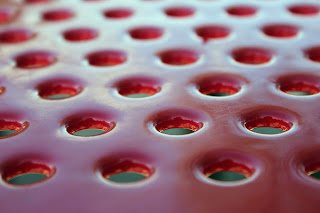
1. I chose this picture because the read is a eye catcher and the drops on white leading into the center of the paint captures your eye.
2. I read about how it was very hard for the photographer Edgerton had a real hard time trying to capture the moments of when the milk hit the table. It was too dark so he had to used a lot of equipment and bright lights to capture the milk hitting the table.
3. In order to get the picture of things happening so fast like a milk drop you have to get a tube and fill it with milk and make sure the milk comes out as one drop every few seconds. Those drops then pass through an led which triggers the camera to take the picture. This process happens every few seconds and is continuos.
4.
this photo is one of my personal favorites because when the bullet goes through the apple it really catches your eyes of how destructive it is and the destruction leads to the bullet. 
this is one of harolds edgertons most famous photos called "The milk drop" 

harold was born in Fremont Nebraska on April 6 1903 and died  January 4, 1990 
attended the university of Nabraska. 

LUNCH ATOP A SKYSCRAPER 
1. I chose this photo because the line of men and the balancing in the photo is very eye catching. also the back ground of the photo is very interesting and beautiful. 
2. I read that is photo was taken when young men were taking a lunch break while trying to build Rockefeller stadium. They had to ropes or any gear tied to them and this photo is used in New York today to symbolize how New York is unafraid to take risk and tackle hard projects like this one. No one knows who took this photo nor do they know who is in the photo but it is most reproduced photo in New York. 
3. The building of Rockefeller stadium allowed for half a million people to get jobs during the impression and made a difference with the economy 
4. no one knows who the photographer is.

5. 
this is the most famous photo


MICHAEL JORDAN 
1. I chose this photo because the simplicity of the photo real makes the photograph more dramatic and special and the sun in the corner adds more depth to the photo.
2. This photo taken by Co Rentmeester was bough for 150$ to be looked at and is very closely resembled to the Nike logo. This photo was later used to create the logo for Michael Jordans shoe company Air Jordans the photo was called "jumpman" 
3. There was no video or additional information posted.
4. 
this is Co most famous photograph.
this is my favorite photo by Co because all the bodies ad all the lines leading to the center of the circle and the balance in the photo real captures my attention. 
Co Rentmesster was born on Feburary 26, 1938 in Amsterdam 

AMERICAN GOTHIC 
1. I chose this image because you can see the pain and all the wars and battles she had to go through on her face. There is also leading lines from the flag, mop and broom that all lead directly to her so she really stands out in the picture.
2. I read how the photographer took this photo during segregating and he traveled around and looked for African Americans and he found the women named Ella Watson and she told him about the stories of her father being murdered along with her husband and how she had to face thing alone.
3.This is the photographer took this photo in contribution of Styles of Grant of Wood.
4.
This photo really caught my eye because the way his are looking to his left really bring in more of a dramatic feel and how his face is worried looking like someone might catch him or someone is going to kill him.
This is Gordon Parks most famous picture.
5. Gordon Parks was born on November 30,1912 in Fort Scott, Kansas. He was a self taught artist so he did not attend a college to learn his photography. He died March 7,2006

Gorilla in the Congo 
1. I picked this image because the free really catches your eye and the gorilla in the middle is black so you see all this green and then this gaint black spot in the middle. it also made me feel really sad when i first looked at it. 
2. In congo they were under attack by illegal people cutting down wood and shot and killed many of these gorillas illegally in a National park. In this photo they are peacefully caring this gorilla out of the jungle. 
3.Photo included more photos of what happened and more photos of gorilla that were shot in the incident. 
4. 

5. Born in 1969 in Durban South Africa 
he is still currently living.
he works for National Geographic.


Sunday, November 27, 2016

5 Website

Photography resolutions For 2016

http://petapixel.com/2014/12/31/10-photography-resolutions-new-year/

1. On this website i looked at different pictures of people and how the pictures relate to what the publisher wanted. Like there was a picture of a girl sitting on the floor with papers flying around everywhere and the publisher talked about how you need to be organized for the new year in 2016 when dealing with taking photographs.

2. I learned how in 2016 you need to be yourself and shouldn't care what any one thinks about you and you pictures. You should take pictures of what you want and how you want. You need to be organized when it comes to taking photos When using photography you can use photo shop and use it more. Be respectful of other photographers and there photos and there work because they probably worked really hard on it.

SEVEN TIPS FOR SHOOTING GREAT PORTRAITS
http://blog.phowd.com/2014/09/7-tips-shooting-great-portrait-photographs/ 

1. On this website I looked at 7 different ways to take a good portrait picture. It showed me examples to follow when taking portrait pictures. It also gave me some tips when it comes to taking a portrait.

2. I learned about negative space and how many photographers try to crop out as much left over space but sometimes you can leave space around the subject and the space is called negative space.

4. I picked this photo because you eye focus in on the black berry but the main subject is the man below the black berry. I don't know who took this photo but they used some rule of thirds and balance in the photo.

THE OLDEST LIVING THINGS IN THE WORLD
http://www.rachelsussman.com/oltw/

1. On this website I looked at really old living things around the world. The picture were mainly of trees and nature and no people. The picture were from all around the world and on different continents.

2. I learned that nature is older then what it appears to be

3.
I chose this photo because it uses the rule of simplicity and really focuses the lookers attention on the tree. The tree is not the best and not the fullest looking tree but because of that I like the picture much better. This photo was take by Rachel Sussman.

SPIRAL STAIRCASES
http://petapixel.com/2014/12/19/disorienting-beauty-spiral-staircases-old-abandoned-buildings/

1. On this website I looked at staircases from a German photographer. This photographer grew up in east Germany and goes around to empty and abandoned buildings and finds staircases and takes pictures of them.

2. I learned that when taking picture if star cases it really distorts the eyes because you cannot tell whether or no you are looking down the stairs or up the stairs.

STYLE
http://petapixel.com/2014/08/25/approaching-problem-style/

1. On this site I learned new way to create style when taking pictures. The website also gave me tips on how to create style and showed me examples of style.

2. I learned that style does not come on its own. You have to engage in the photo taking and really try to capture what the persons wants in the photo.

Tuesday, November 15, 2016

Fashion

1. I don't think it is right to change how someone looks that much. Everyone talks about how everyone is beautiful the way they are and yet there is companies out there that change the way people look that much. And when they change someone that much it makes other people want to look like that when in reality no one can look like that.

2. Yes. You change the picture a little bit but not the extent to where the person doesn't look the same any more.

3. Some types of changes that are ok are like chasing the background of the picture of or make some colors stand out or make it more sharp.

4. Fashion photography is photographs that are for the people and the photographers want to please the people and its for advertisement. photojournalism is taking photos of things you like and want to take pictures of. And it isn't to impress people or sell them something.

5. Both fashion and photojournalism have to deal with taking pictures. however photos for one photo are taken for peoples liking and another one is for your liking.


6. I think you are showing us these videos to show how much photoshop you can do on a photo and how unrealistic they can be. I also think you are showing us these because too much photoshop will be bad for the photo.

7. They only use girls in this photo because it is easier to photo shop girls to make them look more pretty.

Wednesday, November 9, 2016

Post #4

Image based: this means that the cover page has people in it or is a picture of something. This is usually people smiling and having a good time. But some magazines have them not smiling. The person in the photo on the cover usually seems the item or is the main attraction to get people to buy the magazine

Illustration: where the cover is not a photograph it is a drawing of someone or something. Many of them are funny or unusual and what u wouldn't normally see everyday.

Type: where there is little to no picture on the cover only type and words. The type is only used when they want to make something dramatic and stand out by its self.

Concept: is usually a mix of all three magazine types. They point in using this is to make the audience understand what u are trying to say very soon. Usually seen in business magazines

Post #3


favorite

Photographer: Hannah Whitaker
Designer: Arem Duplessis
"This cover story by Michael Pollen argues that while we have been obsessed with eradicating germs, there are health advantages to being exposed to them. The cover shot by Hannah Whitaker of a baby being licked by a dog makes graphic the prevalence of germs in our everyday lives."


In this magazine cover babies are seen as little germs and how they have germs. along with the baby the dog is also portrayed as having germs like the baby. This is shown in a bad way and how germs are not good, but the magazine didn't want to disgust the people so they put a baby on the cover to attract people's attention and no disgust them. The lighting on the photo is good and I like how the baby and the dog are both centered in the middle and almost balanced even. 

Post #2

1. Environmental portrait
2. Informal
3. Informal
4. Environmental
5. Environmental
6. Environmental
7.  Informal
8. Informal
9. Environmental
10. Formal
11. Formal
12. Environmental
13 environmental
14. Formal
15.  Environmental
16.  Environmental
17. Informal


Tuesday, November 8, 2016

Post #1

1. Familiar recognition with the brand of the magazine
2. make sure the image appeals to the lookers
3. make sure the cover catches the people walking by eyes
4. make sure there is benefits to looking at the magazine and make the reader want to open it
5. make sure u get something out of it


Thursday, November 3, 2016

Start Planning

A good tip for taking a portrait is you can sometimes add blur to make the picture be blurry but you are still able to see what is happening in the photo.

Framing the portrait can make the inject really stand out like using a blanket or bars to only show a certain part of the subject.

You can also add some movement in the photo to make the subject stand out more.

 I really liked this photo because the way the camera is facing and taking the subject it is really cool and draw you eye to the center of the net and the persons face at the end

I like how in this photo you can read and see the sign in the background but the background is blurred   to where the women in the front is standing out more. 

I like the background of this picture and how it really makes the girl stand out and look more vibrant.

I like in this one how the brick wall makes you eye lead directly towards the man at the end. 

in this photo because it is in black and white it really adds more a dramatic feel to the photo and how the photo is up close and the subject is not directly in the middle of the picture. 
again this picture is in black and white so it is more dramatic and also the girls eyes are not looking directly at the camera the are looking above. 


For my portrait i will shoot a picture of my sister and i want it to be outside in the nature where the background is blurred or of her inside and the photo will be black and white where you could get a feel of her natural habitat. I and going to do a shoulders up lind of photo and i don't want her looking at the camera i want her looking to the side of it or above it and i don't want her smiling either i want to capture her natural beauty and her true face.  Because the photos might be outside the camera will need to be set on a lower iso and a faster shutter speed but if it is inside the iso will be higher and the shutter speed will be lower and then i will photoshop the photo to make it back and white. 


Tuesday, November 1, 2016

American Soldier

1. The most important picture is the one called " a fathers concern " because it shows Fishers low point in his life and when everything was bad and nothing was good.

2.  The images show his life of growing up and how the military had changed his forever and his daily routine.

3. The go into more depth of what is really happening and also explain why he looks so sad or is feeling happy when he should look happy.

4.  Ian Fisher joined the army when he was 17. He was taken to a camp where he learned the basic needs of being in the military. He was not the most mature one in the group, he was always getting others into trouble and messing around. He was planning on getting married but him and his girlfriend sadly broke up and this was during the time he was getting injured all the time so he was taking a bunch of pain killers and almost becoming a drug user. He still went back to the army where he was still not fitting in. at home he was also not fitting in and he didnt know what to do so he decided to go to church and get baptized. He then got a new girl friend names Kristen and let to go to Iraq. in iraq he was in charge of driving one of the vehicles. After a while in Iraq he returns home and gets married to his wife Kristen.

5.  The verbs are in present tense, like it is happening right now.

6.  On average there is about 2-5 sentences.
      The first sentence provides information about what is happening in the photo    
      The second sentence gives you background information about what has been happening.
       the third gives you information on other object or other people in the photo.
      Some caption include a quote if someone is saying or said something
      no

7. The photos give the exact date of when it happened and the photos are only of major events that happened or happens in life.

8. The story is able to give a lot more background information instead of just cut to the chase kind of information like the captions.